
TexID
Moving into modern
Timeline
Spring 2025
4 Weeks
Tools
Figma
Adobe Suite
Type
Independent
The Challenge
One size fits all? Not quite
Identification serves many purposes - age verification, identity authentication, and information searches - wait, when does my license expire again?
As states pilot mobile IDs, it's becoming clear that they offer greater security and are harder to replicate. However, integrating mobile IDs faces challenges due to a lack of trust from both sides—users worry about sharing personal information through an app, while traditional physical IDs offer visible authentication features like holograms.
We need a digital solution that mirrors real-world control and authentication
How can I help users share information quickly but maintain privacy?
1 - Group information simply
2 - Take advantage of the flexibility of mobile interfaces
The Solution
Tailored experiences for different needs

Check official information
A full-age ID was essential for this design, prioritizing the user's name, ID number, and age - key details identified by research as the primary focus for law enforcement.
It’s also best for users who need all their information at their fingertips. Information is structured into four categories: User, Address, Vehicle, and Anatomy.
Hide sensitive information & scan QR code
Users are able to switch screens, displaying only name, ID number, and date of birth while hiding personal details for privacy.
Tap-based animations add another level of authenticity.

Logo Animation + Static Mockups

Logo Design
Texas Longhorn +
Lone Star State

Full ID
4 Groups: User, Address,
Vehicle, and Anatomy.
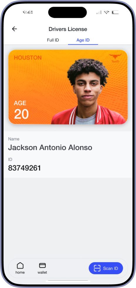
Age ID
Date of Birth, Name,
and ID number

Wallet
See licenses, next pay date, and pay amount due

Age-only QR Code
Loud shout showing age, with DOB as secondary information

Full-ID QR Code
Additional Vehicle and Anatomical Information
Designs & Decisions
Designing a cohesive experience
I designed the main flow with returning users in mind, making it intuitive and inviting for continued use.
By adhering to the established color scheme and parameters, I ensured a clear and cohesive experience
What colors feel Texan?
I created a color palette that works with the sun and the bluebells

How do I show identification that makes sense?
Even in the digital world, reward cards, bank cards, and plane tickets continue to mirror their physical forms.
Rather than re-invent this familiar and effective design, I embraced this mental model, designing my digital card with the same intuitive structures as other apps
Notes from designer to designer...
Inpsiration comes from the oddest places!
Mine were Pokemon cards


Notes from designer to designer...
Iterate continuously - don't stay stagnant.
See 6 out of 14 failed card designs

V.15 (winner!)
Successfully shows the important information

V.14
The text and image are fighting

V.13
Introducing gradients

V.12
Playing with z-depth, slightly bigger card
Conclusions
Looking to declutter information
This was a valuable exploration of information architecture, focusing on how to reorganize an existing system that most people are already familiar with. The goal was to make changes that are clear and effective without overwhelming users.
In one month, I moved from concept to completion, designing a product while researching existing solutions. I'm excited to see how this evolves as more states adopt mobile identification systems and how well my design meets the mark.
What's next?
I’d love to explore the idea of adding identifications into the app and further safety/security features
- How would users go about adding their identification?
- How can we design this to be trustworthy and intuitive?
Notes from designer to designer...
Step back, rethink, and try a new approach.
Stay true to the essence of your idea, not just your initial interpretation of it.